Link to the presentation: https://docs.zoho.com/show/publish/30xmz17239681d39f42f698d859ac81ea054f
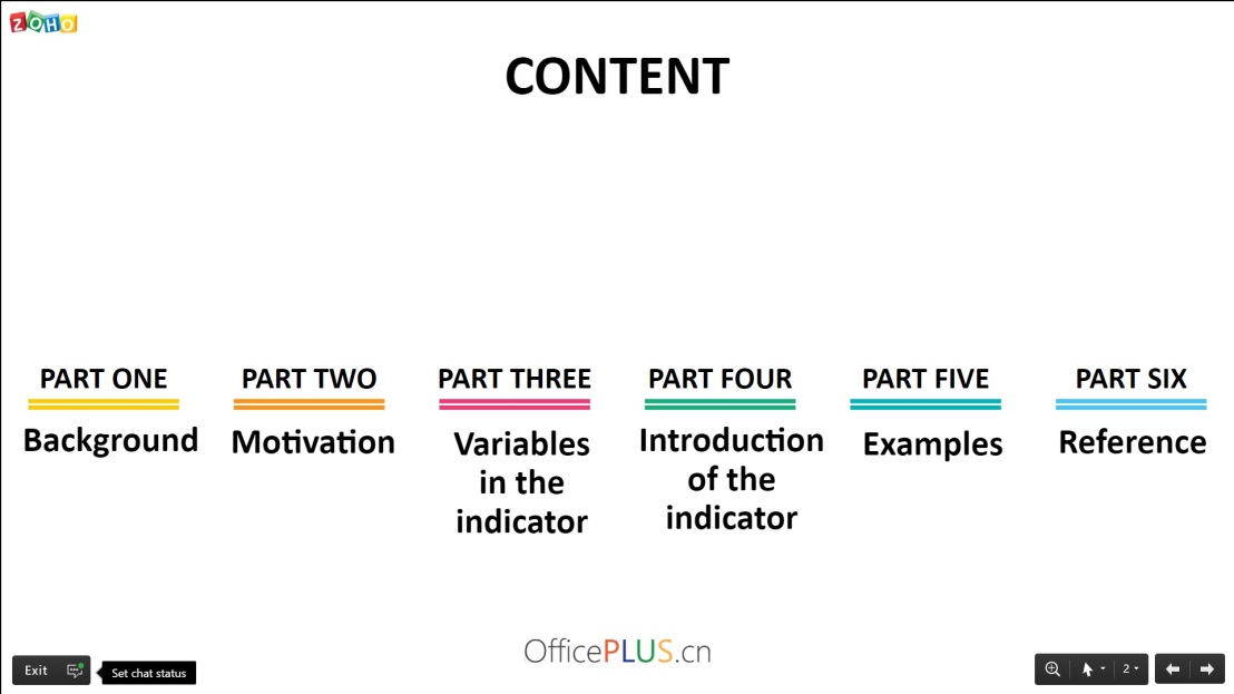
The CS & Economics presentation was done cooperatively by David and me, and the theme of our economic measurement was about the effectiveness of medical care in the world. The presentation was separated into several parts, in which we introduced the background and the motivation of our topic, the variables and the formula of the indicator, and finally, some examples of this indicator being applied to different countries in the world (shown in a spreadsheet).
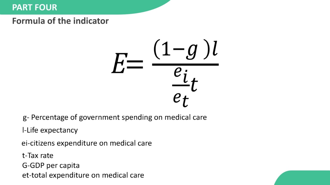
The formula of our indicator may take a while to fully understand due to its complexity. However, we did not do very well on effectively explaining this formula to the audience. The slides of our presentation did not include any pictures, graphs, or diagrams assisting the oral presentation. The time limit also restricted us from clearly explaining all the elements involved in the formula.
Our group cited all sources properly, and the font and the color did not hinder the audience from seeing all the contents on the slides, so I consider that those two requirements have basically been met by our group.
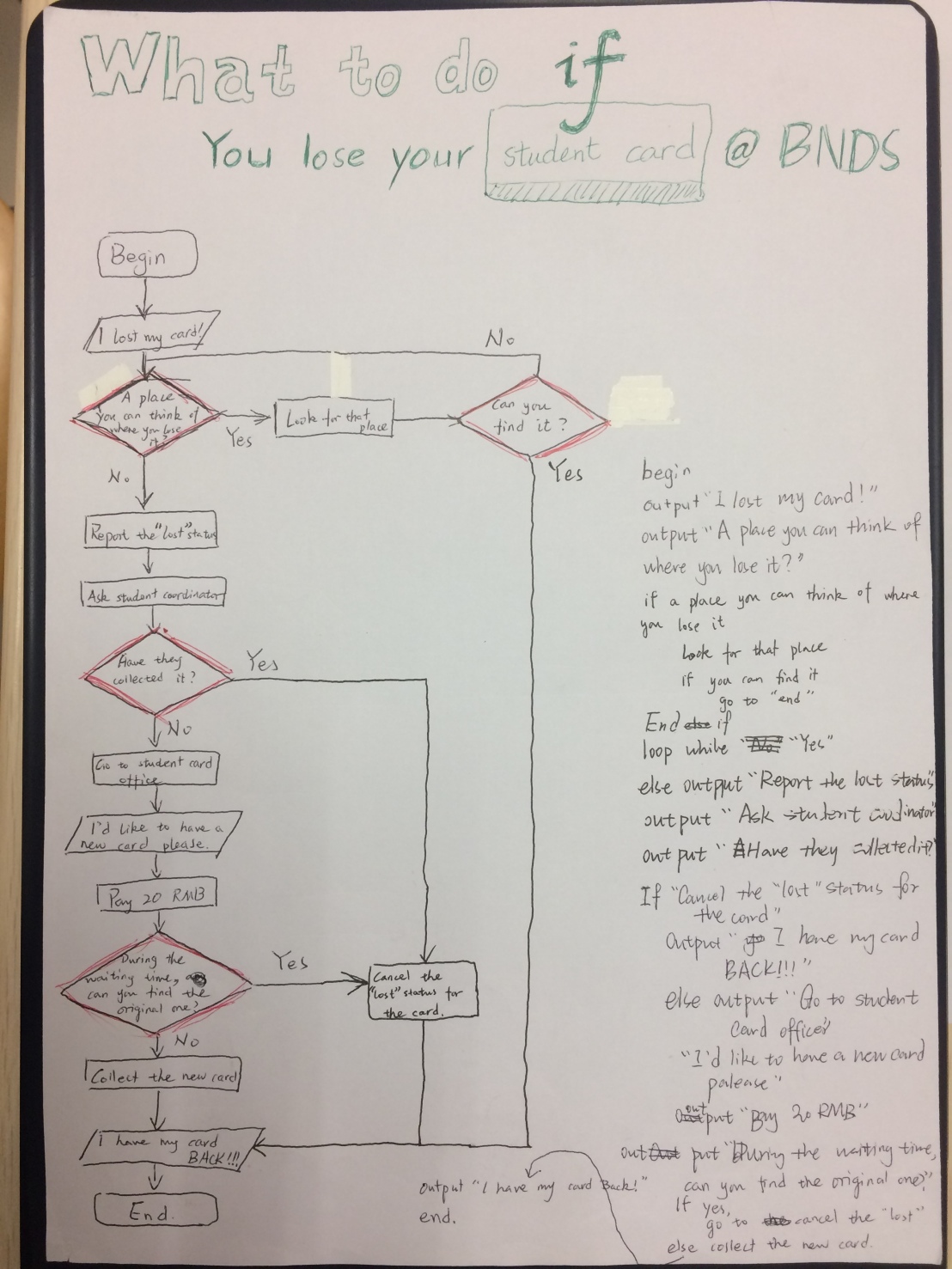
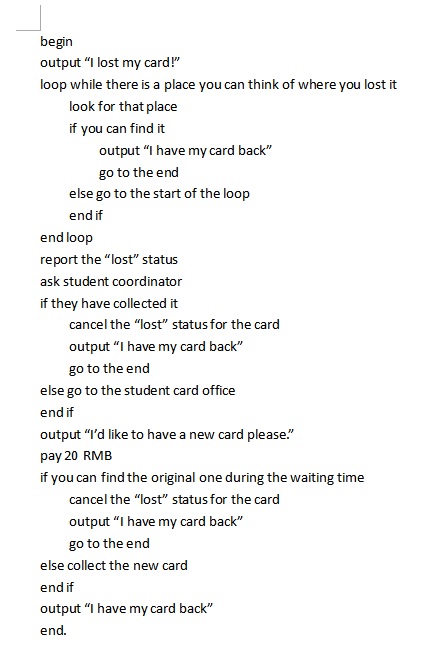
The flowchart and the pseudocode we made reflect the process how we came up with the formula of the indicator. We had several conditions and two loops in both the flowchart and the pseudocode, in which we processed the information inputted (for example, the different variables that we considered to be parts of the indicator) and got some results as output.
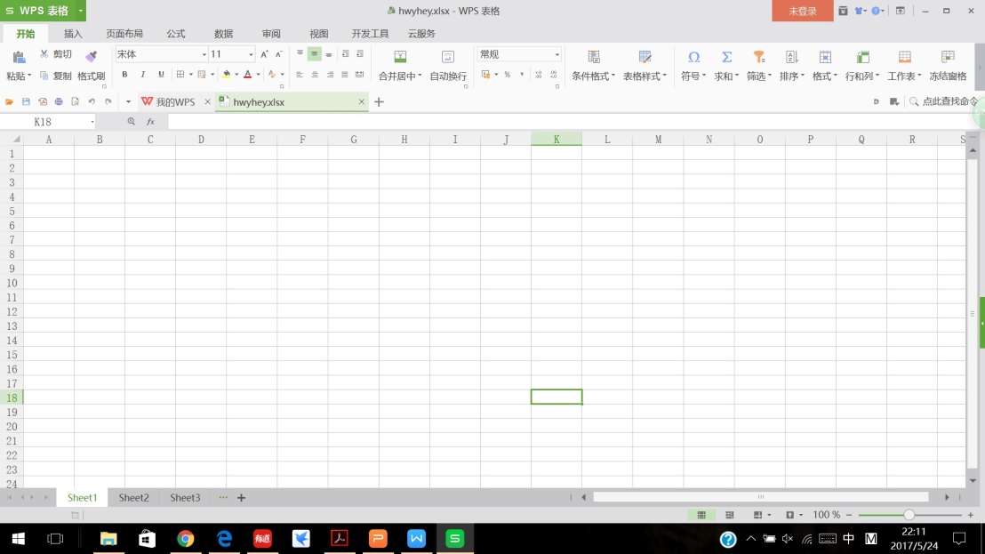
The spreadsheet gathers the data of all indicators from some countries in its first several columns, and then a function calculates the result according to the raw data and the given equation. The final figures are recorded in the last column. Charts that show these final data graphically help to make comparisons between countries and regions.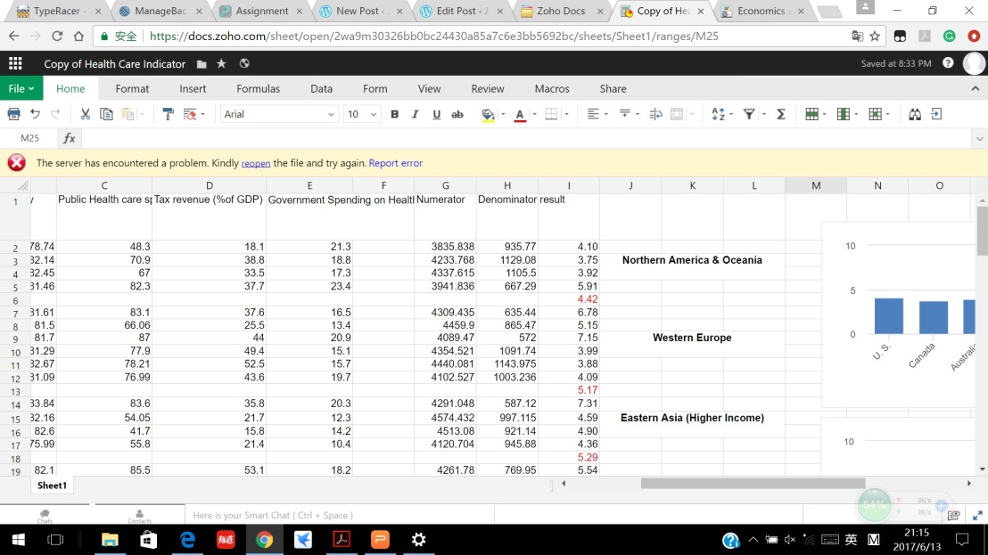
The link to the spreadsheet is: https://docs.zoho.com/sheet/published.do?rid=2wa9m30326bb0bc24430a85a7c6e3bb5692bc